Green system percentage vs user visible issues
How much of your system does your internal monitoring need to consider down before something is user visible? While there will always be the perfect chain of three or four things that can cripple a chunk of you customer visible infrastructure there are often a lot of low importance checks that will flare up and consume time and attention. But what’s the ratio?
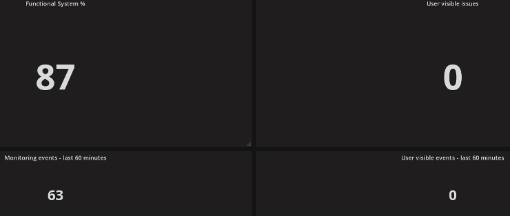
As a small thought experiment on one project I’ve recently started to leave a new, very simple four panel, Grafana dashboard open on a Raspberry PI driven monitor that shows the percentage of the internal monitoring checks that are currently in a successful state next to the number of user visible issues and incidents. I’ve found watching the percentage of the system that’s working rise and fall without anyone outside the company, and often the team, noticing to be strangely hypnotic. I’ve also added a couple of panels to show the number of events of each of those types over the last hour.
I was hoping the numbers would provide some inspiration towards questions like, “Are we monitoring at the right level?”, “Do we need to be running all of these at this frequency?” and similar questions but so far I’ve mostly found it to be reassuring that it can withstand small internal failures while also worrying about the amount of state churn it seems to detect. While it’s not been as helpful as alert summary roll ups it has been a great source of visual white noise while thinking about other alerting issues.