Planning against themes with radar charts
In a previous role we were working on a large set of services, each with a variety of projects on the backlog. We were having issues deciding what to work on first so we decided to try a few different ways to evaluate the possible options. My prototyped contribution to the process was to try and map each piece of work against a number of themes / values we’d all agreed on and display them on a radar chart.
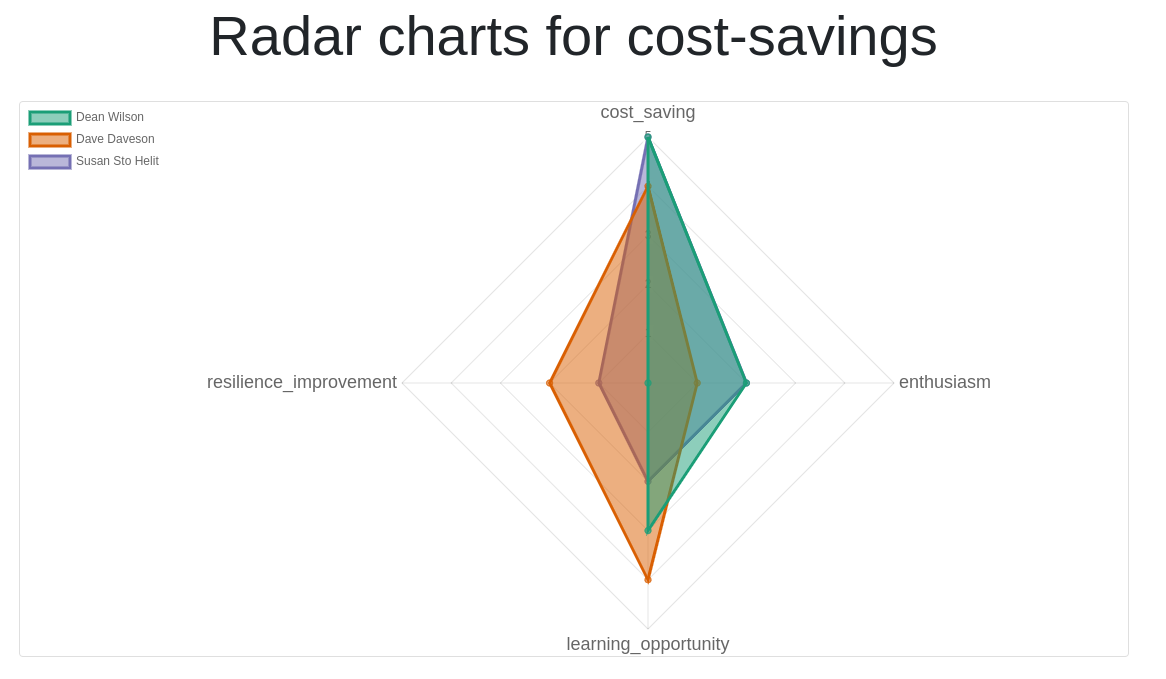
“A radar chart is a graphical method of displaying multivariate data in the form of a two-dimensional chart of three or more quantitative variables represented on axes starting from the same point” – Wikipedia: Radar Charts. I however naively picked them due to how nicely you can overlay the data from multiple participants in quite a small space. Until you have more than a few people participating anyway, after which it becomes a bit… brown.
The very rudimentary tooling I wrote uses a directory, named after the
potential mission, with a little bit of metadata and one YAML file per
participant. Each person gives a score on how well the mission
represents each theme and once you’ve gathered them together you start
flask and point it at the directory, load the page in a web browser and
see where people agree and disagree. It was quite a fiddly approach but
it was quick to get working and while it wasn’t sufficient on its own it
did help provide another view on what people considered the most
relevant part of each mission based on our chosen success criteria.
The code is on GitHub as Themes to radar and while I intended to tidy it up and allow selection of the missions from the webui I think it’s time to admit I’m never going to, the tool did what it was supposed to, and the value in learning from it has happened.